
When is Clean Data Too Clean?
Best Practices for Data Cleansing with Advanced Analytics
Lately, there’s been a lot of talk about data cleansing. But is it possible to clean your data too much? What does that even mean? Many engineers don’t even realize that they are cleaning their data and are just doing so because they are forced to by whatever tool they are using (i.e. to comply with Excel’s limit of 1,048,576 rows or because they are just used to seeing their data in a certain way).
Aggregating Data for Easier Visualization
If the raw data is sampled at one-minute intervals and you choose to look at it in one-hour intervals for whatever reason, this is altering the data. In some cases, this kind of down sampling is ideal. But could this actually lead to inaccurate conclusions and wrong answers? Let’s dig into these questions by looking at a few examples.
Missing Variation
Let’s start off with a simple, but common, example. Often engineers look at hourly or daily averages instead of the raw data when monitoring a process. For this example, let’s look at a pressure signal. By looking at the daily average pressure it seems steady at 30 psi for the entire month of July.
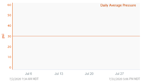
At first glance it looks like the process has been controlled well and there is nothing further to investigate. However, if we pull up the raw data instead, we see a very different story.
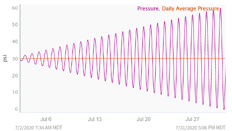
In reality, the variability of the pressure measurement has been increasing greatly over time and we are seeing huge pressure swings. This almost certainly is an issue, but we would never have known if we had only been looking at the daily average pressure.
Missing Important Outliers
Looking at hourly or daily averages is only one method used to down sample or aggregate data for easier visualization. Another method of down-sampling is just keeping whatever data point is at the beginning or end of the time window (for example, the data point that is at the top of the hour if you wanted to look at hourly data).
For example, if you look at the following trend when trying to investigate a process or equipment problem, you may not be able to determine the cause.
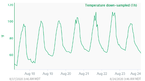
Everything looks to be as expected for this particular process. However, upon investigation you realize this data has been down sampled and is only giving you the data point at the end of each hour. When looking at the raw data (two-minute sampling rate), you see a very different picture.
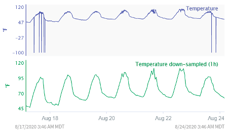
The raw data makes it much easier to spot the problem.
As shown, sometimes data can be too clean! Raw data often reveals very important information lost down-sampling or averaging. It’s important to always use data that is fit-for-purpose. This usually means starting from the raw data and then doing some data cleansing and down-sampling as appropriate for the specific analysis.
Seeq and Spike Catcher for Data Representation
Since Seeq connects directly to the data source, you never have to worry about these issues. Seeq uses a special algorithm called Spike Catcher to ensure that no matter how dense your data is, how long of a time period you are trying to display, or how few pixels your screen has, you will never miss an important feature in your data.
As you zoom in and out, Seeq is constantly adjusting the visual representation of your data based on the amount of data to be displayed and the number of pixels on your screen. Once you determine that data cleansing is appropriate for a particular analysis, you can easily use one of our smoothing tools, such as our Agile Filter, to remove noise or see long term trends.
Ready to see Seeq’s advanced analytics application in action? Schedule a demo today!